In this video, we’re going to create a YouTube thumbnail. While it is a simple process to create your own, the biggest misconception is that you need to be using apps like Photoshop or Illustrator to create your thumbnails. If you’ve got Photoshop or Illustrator and you know how to use them, by all means, definitely go for it. But you can do it without them.
I make most of my thumbnails using Adobe Illustrator, and others have used many other online applications. Today, we will use Adobe Spark because it’s simple and easy to get great results fast. And you can use the free version too.
The following channel has been creating videos online that have received many views, but their thumbnails could use some work—today’s re-design is Gravey’s Brewery.
Adobe Spark
Let’s head over to Adobe Spark and log-in.
If you don’t have an account, go ahead and create an account. Adobe Spark has many YouTube thumbnail templates, as you can see. Google recommends a custom thumbnail size is 1280 pixels wide by 720 pixels tall.
Either click ‘Back Home’ or click on the Spark icon to get back to the main screen. Click on Custom Size, and enter 1280 pixels wide by 720 pixels tall and click next when ready.
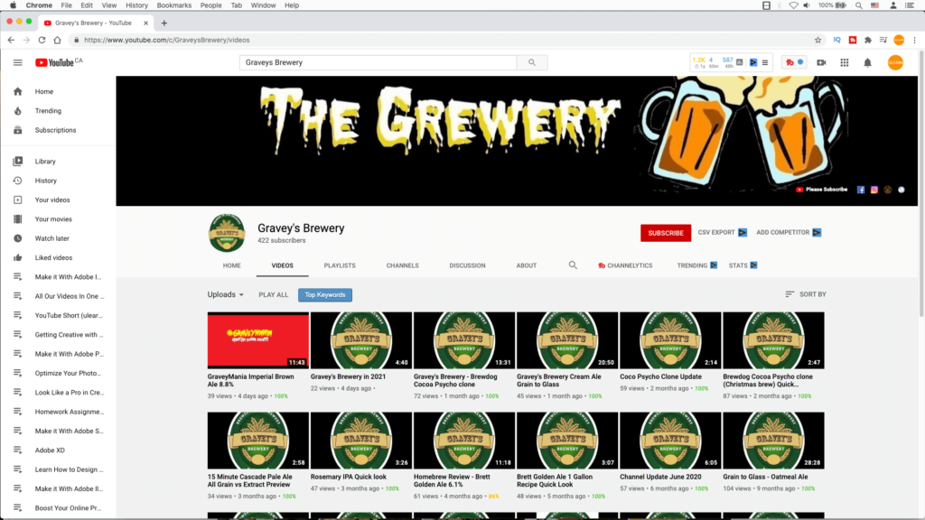
Let’s look at Gravey’s Brewery’s YouTube video channel:

Currently, their thumbnails are mainly a logo of their brew. With any food or beverage video, you want to show the end product. The creator reviews and talks about the brews. In his latest video, it is a dark ale called Imperial Brown Ale.
Process in Creating a Thumbnail Redesign
- I am going to click on the photos icon and find free photos for beer. The cool thing about Adobe Spark is the images are free. Some of the pictures are from Pixabay, Unsplash and Pexels. Go through a few of them. I want a concept that doesn’t have a logo to confuse the video’s title and Gravey’s Brewery logo.
- Once you have found an image, click on the image, and it automatically gets placed on your post.
- I am going to close the sidebar at the top-left corner, as shown here.
- To zoom out, click on the magnify tool or use the keyboard shortcuts, Command Minus (for the Mac) or Control Minus for a PC.
- Place your cursor on top of the image, and the cursor will change into a bi-directional arrow.
- Resize the image to the full width and height as possible. I will extend the image a tad over the size, making sure no slight gaps are showing.
Use the KISS method (Keep it Simple Stupid)
- Click on the text icon. And you will see different templates for the text styling. Anything with a yellow banner means premium users (so, a free account won’t have access to this). This is fine because the premium text templates are way too busy for our needs. Try to keep it simple; we only have 2-3 seconds to grab a viewer’s attention. Click on ‘Add Your Text,’ and I will use his last video title and enter that there.
- On the right-hand side, you can change the font, size, colour. You can also grab it by the corner of the text box to resize it as well. Besides the alignments, I am going to click on the Circle, Grid and Magic alignments. I like the Magic one. Let’s style the text with that! As the text fits the spacing evenly from left to right, and then adjust the line spacing and height.
- White text on a white image makes it hard to read. Add a drop shadow will soften the text a bit here. Hmmm, the drop shadow is a gold colour, so let’s click on the gold swatch to change the drop shadow to a proper colour like black. Click anywhere to apply that shadow or to get out from the swatches.
High-Quality Image. First Impressions Count!
- We could also place the logo but only use the logo if it’s a high-quality image. Click on the logo icon. As you can see, we can’t upload the logo because it’s only for premium users. But, you can place your logo by uploading a photo. It is a small workaround.
- The logo gets placed on your thumbnail. Resize the logo and move the logo anywhere you want. You can rotate the logo with this rotate tool. In this case, I will place the logo as is and push it down past the page as I want to appear it’s the top half of the glass.
- The photo of the beer is a bit light. Usually, I would use Photoshop to fix the colour, but Adobe Spark allows you to go through the enhancements, blurs, and filters. Let’s go to the enhancements section. I want to make my pale ale here to be a darker ale. Play with the effects of brightness, shadow, lighting, contrast. Each image will always be different. To apply the result, click off the effect.
YouTube Thumbnail Completed and Ready for Downloading
- It’s time to download this thumbnail to your computer. You have the option to download this as a PDF, PNG or JPG. I am going to download this as a solid colour PNG.
- It will download into my folder, and it’s called ‘My Post’. Now you can use this customized thumbnail for a channel. I will rename this file, so I know what this file is for record-keeping and email this to Gravey’s Brewery.
