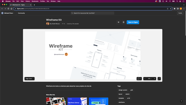
When it comes to design, the key to creating products is to resonate with your users. One way to ensure your designs meet the needs of your audience is by using UI kits and wireframes effectively. In this post, we’ll delve into the process of creating low-fidelity wireframes in Figma with the help of UI kits while maintaining a user-centred approach.
Understanding Low-Fidelity Wireframes
Before we dive into Figma and UI kits, let’s clarify what low-fidelity wireframes are and why they matter. Low-fidelity wireframes are basic, simplified representations of your design, focusing on the structure and functionality rather than aesthetics. They allow you to iterate quickly, gather feedback early, and ensure that the fundamental user experience is solid.
The Importance of Empathy
Empathy plays a crucial role in design. To create products that users will love, you must understand their needs, pain points, and behaviours. By putting yourself in the user’s shoes, you can design with empathy, ensuring that your product solves their problems effectively.
- Define Your User Persona: Before you start creating your low-fidelity wireframes, take the time to define your user persona. Who are you designing for? What are their goals and challenges? This step sets the foundation for designing with empathy.
- Choose the Right UI Kit: UI kits are pre-designed collections of user interface elements like buttons, forms, icons, and more. They can save you time and help maintain consistency in your design. When selecting a UI kit, consider your user persona and the specific needs of your project. Look for a kit that aligns with your user’s preferences and requirements.
- Start with the Basics: Begin by adding the essential elements to your canvas. A header, navigation menu, content area, and footer are good places to start. Keep it simple and stick to basic shapes and placeholders. Remember, the goal is to create a structure that works, not to refine the aesthetics just yet.
- Prioritize User Flows: Put yourself in the user’s shoes and think about how they will interact with your product. What actions will they take? Map out the user flows with arrows or simple lines to indicate the direction of movement. This helps ensure that your design supports the user’s journey.
- Annotate and Document: To add an extra layer of empathy, include annotations to explain your design choices. Clarify the purpose of each element, what information it should contain, and how it benefits the user. These annotations will help your team and stakeholders understand your design decisions more effectively.
- Gather Feedback Early: Share your low-fidelity wireframes with your team, stakeholders, or potential users. Encourage feedback and be open to suggestions. Gathering input from others can provide valuable insights and help you make improvements based on real-world needs.
Why Does it Matter?
Designing with empathy means putting the user at the forefront of your design process. Low-fidelity wireframes, when created with the aid of UI kits in Figma, can be a powerful tool to ensure your design is user-centred. By following these steps and keeping your user persona in mind, you’ll be on the right path to creating products that truly resonate with your audience. So, go ahead, start designing with empathy, and watch your designs come to life with greater user satisfaction.
