Navigating the World of Auto Layout for Responsive Designs
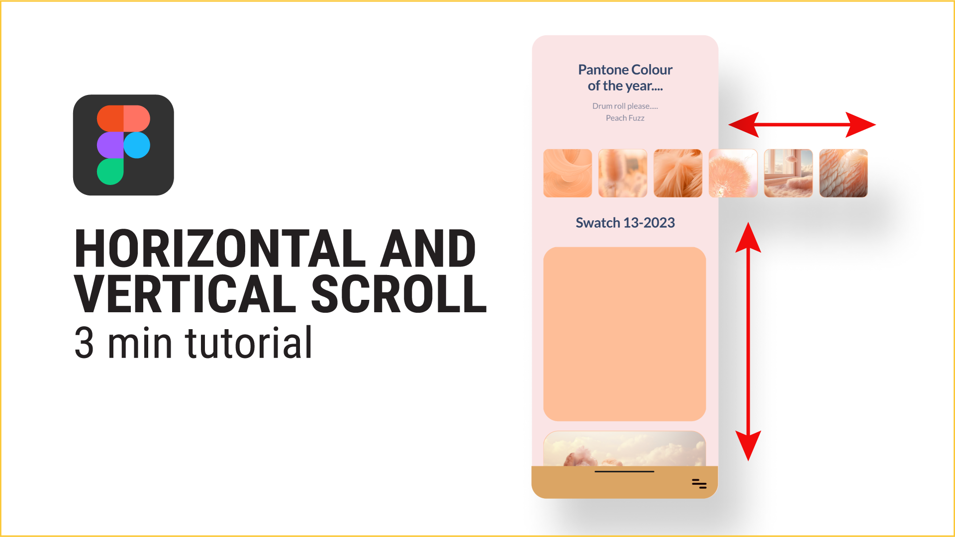
In this guide, we’ll take you through the step-by-step process of setting up both horizontal and vertical scrolling, tailored for Figma designs on either mobile or desktop.
Focusing on Mobile Design for Simplicity
Simplify your design process by using a mobile design as an example. Revisit auto layout basics through the provided video, emphasizing its role in creating responsive layouts within frames. Learn how Frame Selection visually groups and manipulates elements within frames.
Crafting Seamless Horizontal Experiences
Starting with small cards, apply auto layout using the keyboard shortcut Shift A or access the Auto Layout option. Ensure content is contained within the phone frame by promptly clicking ‘clip content.’ Test the functionality in the Prototype stage, maintaining horizontal scroll with the parent and setting overflow to horizontal.
Implementing Vertical Scroll for Larger Cards
Resize the frame to match phone dimensions, making necessary adjustments. Modify the height to align with iPhone dimensions (e.g., 932 pixels). Apply auto layout to prevent content overflow, and position the bottom navigation accordingly. Test vertical scroll functionality in the Prototype stage, maintaining scroll with the parent and setting overflow to vertical.
Creating Seamlessly Interactive Designs
Achieve both horizontal and vertical scrolls effortlessly in Figma by following these straightforward steps. Your prototypes will showcase a harmonious blend of scrolling features for enhanced user experiences. If you’d rather follow the video step-by-step, here you go.