
In the fast-paced world of design, I’ve learned not to cut corners in the selection of colors. Whether it’s for a logo design or a website, the choice of colors deserves careful consideration to make the right impression. While red and green are complementary colors when you consider them on the color wheel, they can be challenging to read when used together in certain contexts, especially when one is used as text on the other as a background. This is because red and green have low contrast and can create issues for individuals with color vision deficiencies, such as red-green color blindness.
Color combinations should take into account both the aesthetics and the legibility of the content. When using complementary colors, it’s essential to consider factors like contrast, text size, and the overall visual hierarchy of the design to ensure that the content is easily readable. In the case of red text on a green background, the contrast may not be sufficient, and it could lead to readability problems.
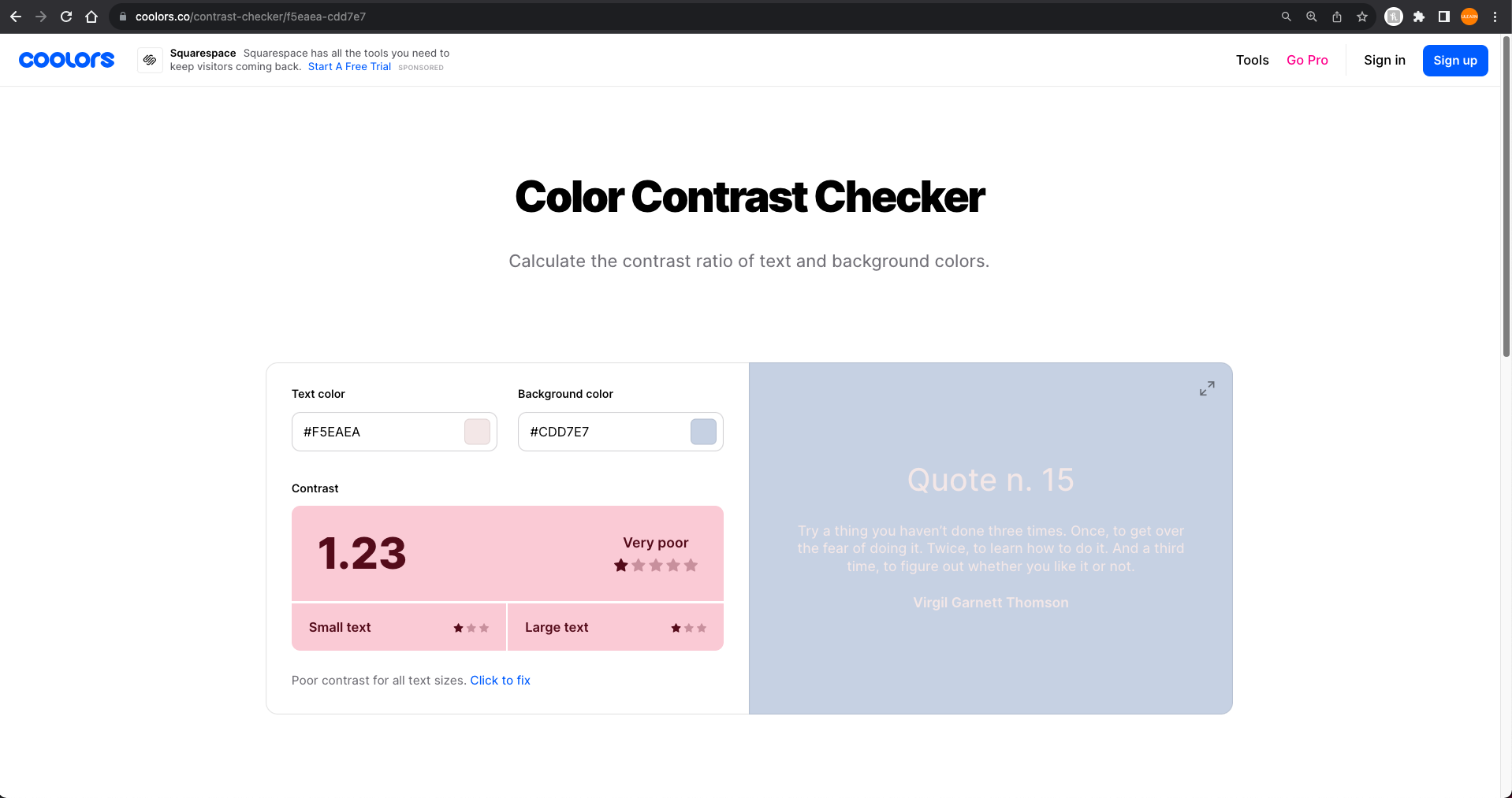
It’s often a good practice to conduct accessibility testing to make sure that your color choices meet the needs of all users, including those with color vision deficiencies. Using tools like color contrast checkers can help you determine whether your color combinations are accessible and easy to read.
Understanding the Basics of Color Theory
Color theory is the foundation upon which you can build harmonious color combinations. It’s the first step to creating impactful color palettes and harmonies for logos, branding and websites.
The Color Wheel
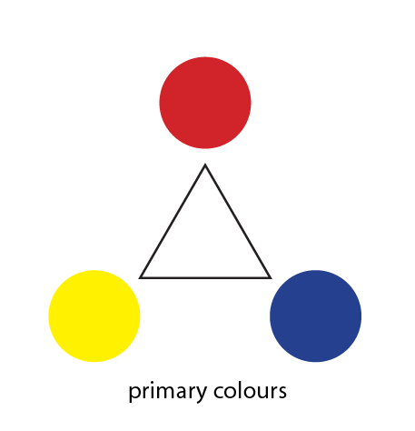
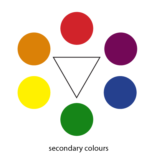
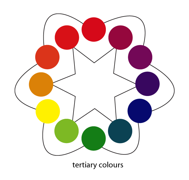
A valuable tool in comprehending color theory is the color wheel. It helps us explore primary, secondary, and tertiary colors.
- Primary Colors: These are red, yellow, and blue, and they form the basis for all other colors.
- Secondary Colors: When you combine primary colors, you get secondary colors like purple, green, and orange.
- Tertiary Colors: These are the combinations of primary and secondary colors, such as red-purple or blue-green.
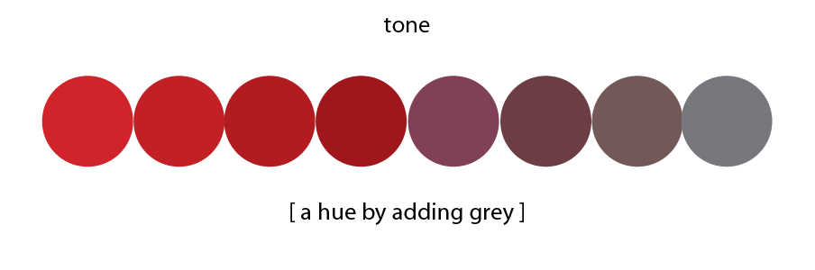
Tints, Shades, and Tones
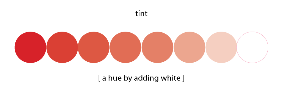
Primary, secondary, and tertiary colors are vivid and pure.
You can definitely alter them by adding white (tints) for lighter shades.
 Or add black for darker ones (shades),
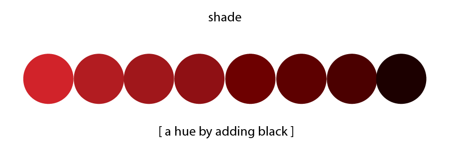
or added both, white and black (aka gray) to create (tones) that are more subtle:
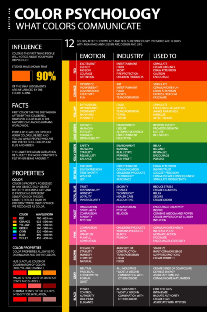
Color Psychology: Influencing Emotions and Behaviors
The Power of Colors in Different Cultures
Colors carry diverse meanings across cultures. For instance, red symbolizes love, happiness, and luck in Chinese culture, while it signifies danger and passion in others. Context matters, especially when targeting a global audience. Another example, during Chinese New Year, unmarried individuals receive red envelopes (in Cantonese, we called them, lai-see) containing money as a symbol of good fortune. I vividly recall the time when my aunt chose to wear red to my grandmother’s funeral, a deviation from the customary black attire—black attire is traditionally worn to funerals!
Leveraging Color Psychology
Color psychology delves into how colors influence our emotions and behaviours. It’s a subjective yet powerful tool in design and marketing.
Colors Evoke Emotions: Different colors can evoke various feelings. For instance, red can incite both anxiety and passion, depending on context.
Common Color Associations: Colors like red, blue, green, yellow, and others have typical emotional associations that can guide brand messaging.
The Role of Contrast
Contrast is a vital aspect of color theory, influencing legibility and visual hierarchy on websites. Accessibility is severely reduced for users with low vision or impairments. Low contrast text is bad for usability (but you already knew that). Contrast is a powerful tool that naturally draws our eyes toward essential elements, helping them stand out and grab our attention. However, it’s essential to strike the right balance. Excessive color contrast on a website can be visually tiring and strain our eyes, making the browsing experience less comfortable. Try using color contrast checkers that evaluates the contrast between two colors, typically text and background colors, to ensure they meet accessibility and legibility standards.
- High Contrast: Using colors with a significant difference in brightness, like white text on a dark background, can improve legibility.

Ikea Colors – High Contrast 
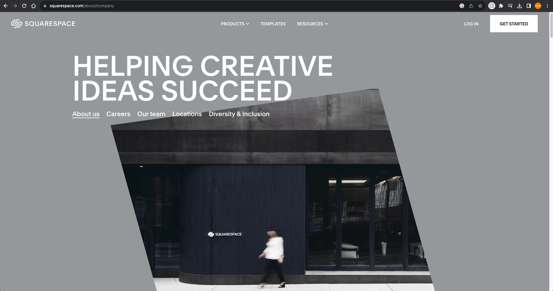
Squarespace Colors – High Contrast - Balance is Key: Striking the right balance is crucial, as too much contrast can strain the eyes.

Selecting Colors for Your Design
A recommended approach is the 60/30/10 rule, which divides your color palette into primary, secondary, and accent colors. Primary colors take up 60%, secondary 30%, and accents 10%. Don’t be confused with the primary colors found on the color wheel. In this context, “primary color” denotes the dominant or main color within a palette, while the secondary color represents the second most prominently used hue in your design.
Color Harmony for Palettes
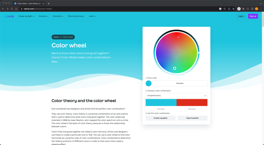
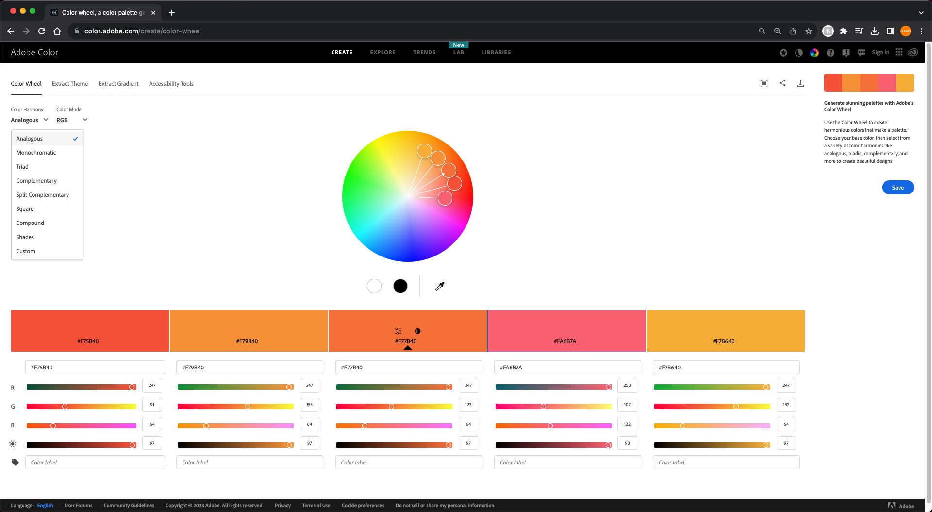
There are various color palettes or harmonies to choose from, including analogous, monochromatic, triad, complementary, and split complementary. These palettes can be created using online tools like Adobe Color (my preferred one, or for many other Canva’s Color Wheel.

Main Types of Color Harmonies (Choosing a Color Palette)
Analogous Color Harmony
Analogous color sit next to each other on the color wheel, offering a subtle yet harmonious look. Color schemes are often used in web design to create visually harmonious and pleasing color combinations. Many websites incorporate analogous color schemes to achieve this effect.
Examples of analogous websites:
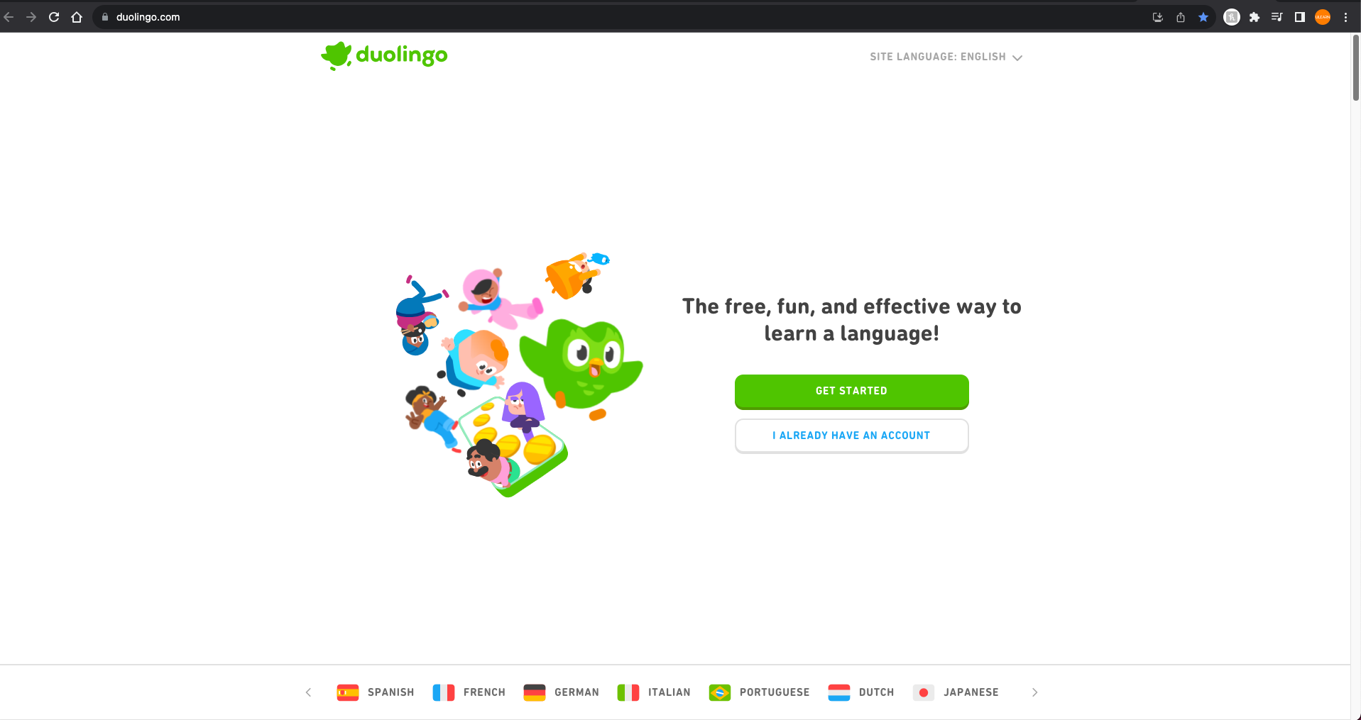
Duolingo: The language-learning platform Duolingo incorporates analogous colors in its branding, using vibrant shades of green and blue. This color scheme helps convey a sense of growth and progress.
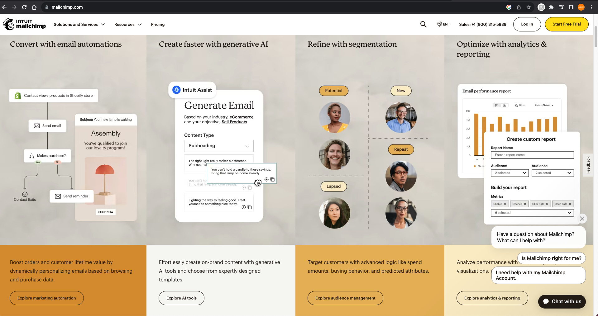
MailChimp: MailChimp, an email marketing platform, employs analogous colors in its branding and website. The use of cheerful yellows and oranges creates a friendly and approachable feel.
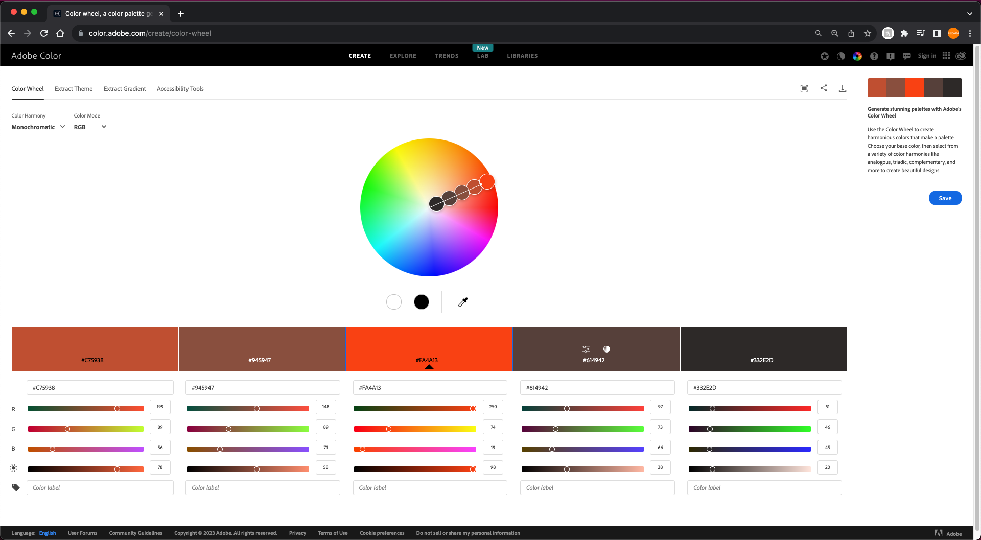
Monochromatic Color Harmony
Monochromatic color schemes are based on a single color, using variations in contrast colors or the use of saturation and brightness to create a harmonious and minimalist design. These websites effectively use monochromatic color schemes to convey simplicity, elegance, and a focus on content or products while maintaining a cohesive and visually appealing design.
Examples of Monochromatic websites:
Dribbble: Dribbble, a platform for designers to showcase their work, often employs a monochromatic color scheme, using shades of gray and black. This allows the vibrant and diverse design work showcased on the platform to stand out.

Medium: Medium, a popular blogging platform, uses a monochromatic design with shades of gray and muted colors. This design choice puts the focus on the content and provides a clean and distraction-free reading experience.

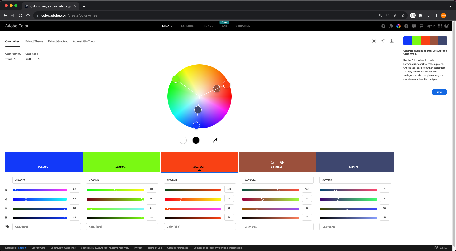
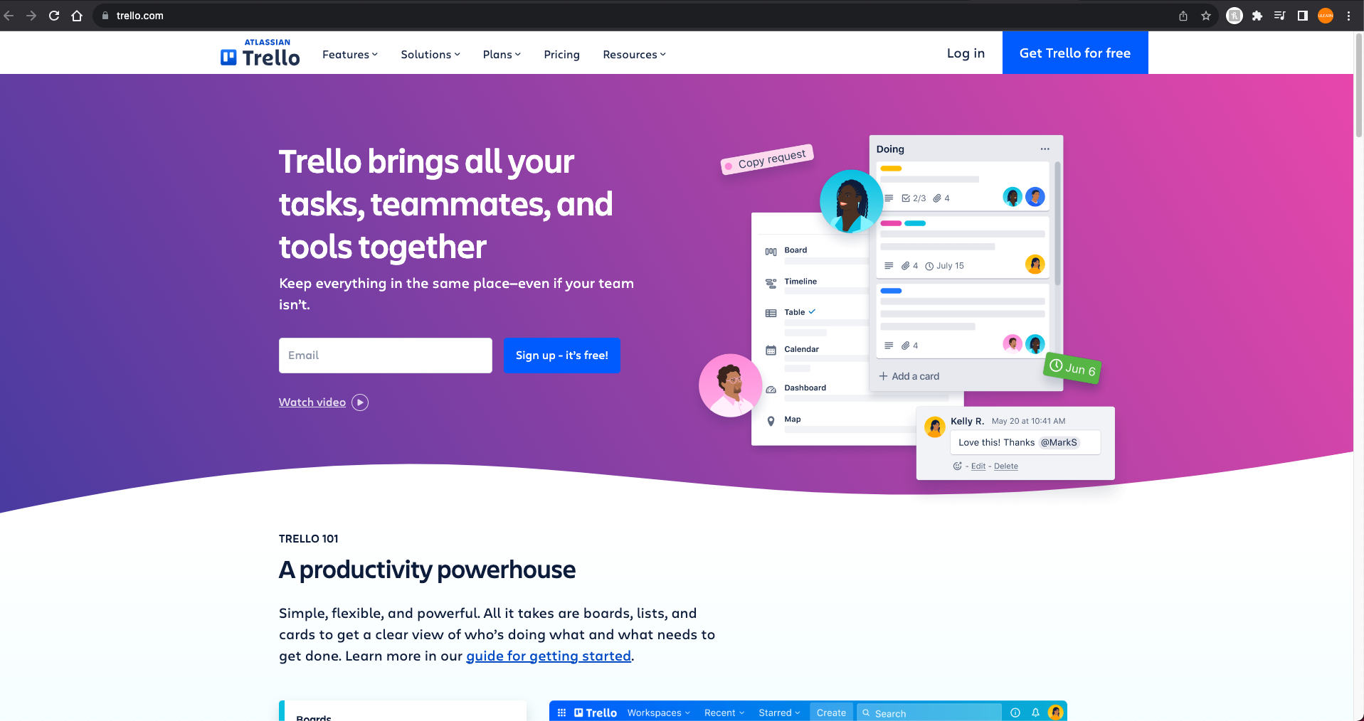
Triad Color Harmony
Triadic color schemes are created by selecting three colors that are evenly spaced around the color wheel. This scheme creates a visually vibrant and balanced look. Websites that use triadic color schemes often feature three distinct, contrasting colors. Websites that effectively use triadic color schemes to create a dynamic and visually engaging design, making them stand out and leave a memorable impression on users.
Examples of Triad websites:
Trello: Trello, a project management tool, uses a triadic color scheme with bright blue, purple, and green colors. These colors help users easily distinguish different cards and labels in their boards.
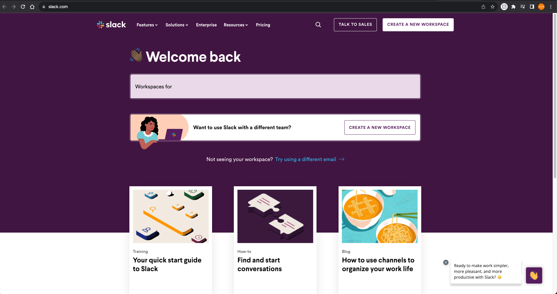
Slack: Slack, a popular team collaboration and messaging platform, utilizes a triadic color scheme with variations of purple, blue, and green. These colors are used for branding and interface elements.
Complementary Color Harmony
Complementary colors are pairs of colors that are opposite each other on the color wheel, creating a strong contrast when used together. This contrast is often used in web design to make specific elements stand out. Complementary color schemes are often used for their ability to draw attention to specific elements and create a visually appealing contrast.
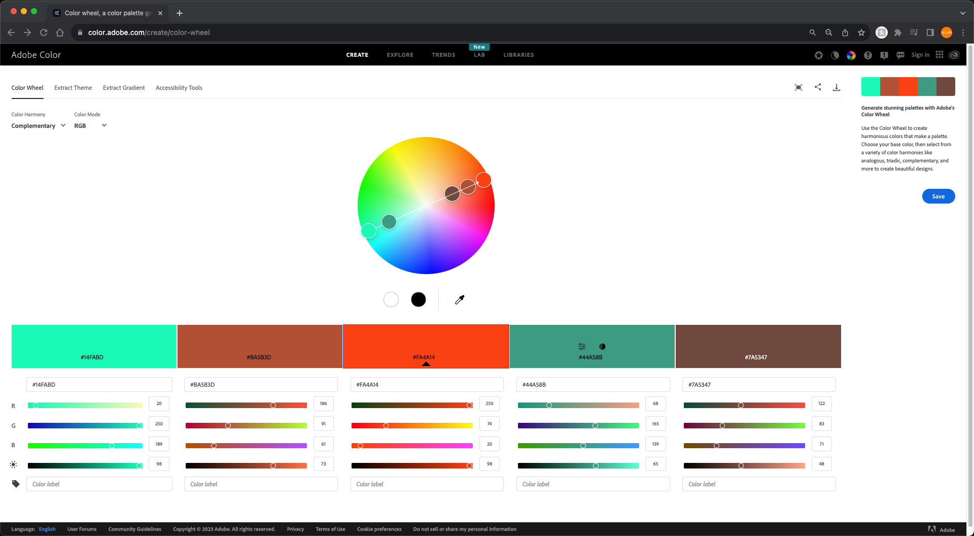
Examples of Complementary websites:
HubSpot: HubSpot, a marketing and sales software platform, incorporates orange and green as complementary colors. The bold contrast emphasizes key elements on their website.

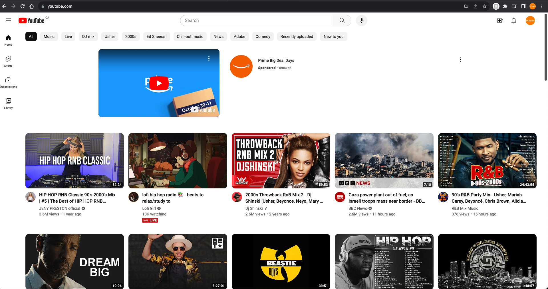
YouTube: YouTube, a video-sharing platform, incorporates red (often used for its logo) and white as complementary colors. This combination provides a striking contrast and helps the logo and branding elements pop.
Split Complementary Harmony
Split complementary color schemes are variations of the complementary color scheme. In a split complementary scheme, you choose one base color and then use the two colors adjacent to its complementary color on the color wheel. This creates a harmonious yet striking visual effect. While split complementary schemes are less common than other color schemes it’s still used by some of the top name brands!
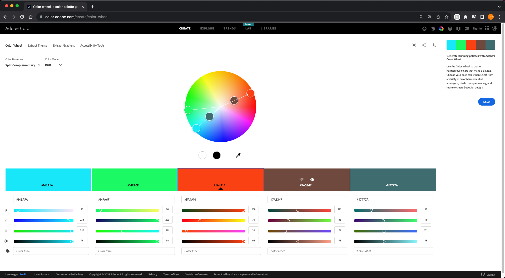
Examples of Split Complementary websites:
InVision: InVision, a product design and prototyping platform, features a split complementary color scheme with a dark blue base color and shades of green and pink. This combination reflects creativity and innovation.

PayPal: PayPal, a widely used online payment platform, features a split complementary color scheme with blue as the base color, complemented by light blue and a hint of orange. This combination suggests trust and security.

Remember, the 60/30/10 rule is flexible, and you can adjust it to suit your design needs. The key is to focus on the primary color and use others to enhance contrast and emphasize essential elements. With a solid grasp of color theory and psychology, you can make informed choices that resonate with your target audience and effectively communicate your brand’s message.

Airmiles provides a noteworthy illustration of the application of the 60/30/10 rule in corporate branding. In this case, blue takes the lead as the primary color, while white serves as the secondary hue, and grey emerges as their accent color.
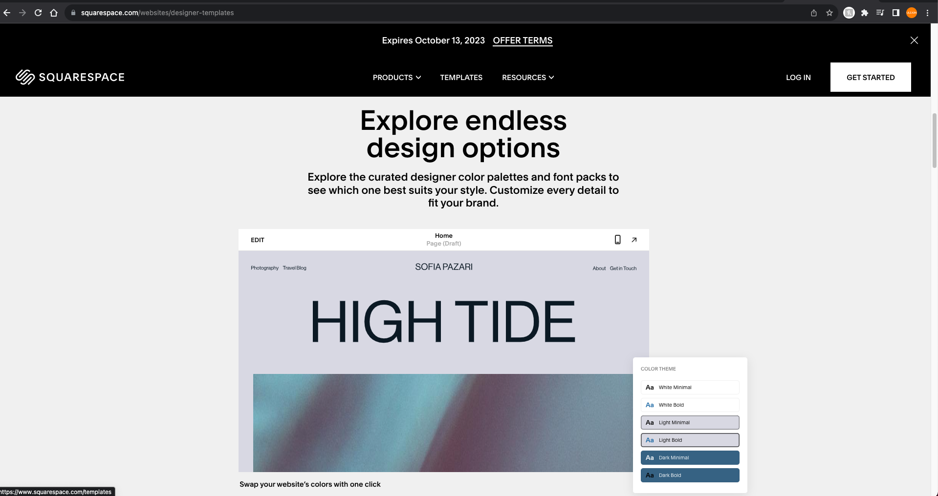
Squarespace, a website builder and hosting platform, features a 60/30/10 color scheme in many of its templates. A dominant color is applied to background elements (60%), a secondary color for content (30%), and accent colors for buttons and highlights (10%).
These websites shown in this blog post effectively use different color schemes to create visual harmony, establish a specific mood, and enhance the user experience. Keep in mind that web design trends and color schemes may change over time, so it’s a good idea to explore current websites for the latest examples. Websites that utilize the 60/30/10 color scheme to create a balanced and visually appealing design guides the user’s focus and enhances the overall user experience. It may sound simple but, it’s quite effective way to create a balanced color palette for web design.
Here’s how it works again…..
First, you select a primary color that makes up 60% of your palette, and this becomes the dominant color. This color is usually used for backgrounds and the larger areas of your design. Next, you’ll choose a secondary color, making up 30% of your palette. This color complements the dominant one and is perfect for text, content, and other design elements that you want to make stand out. It creates a visual contrast with the dominant color. Lastly, the remaining 10% is reserved for the accent color. Accent colors are fantastic for adding highlights, emphasizing call-to-action buttons, or drawing attention to smaller design elements.
This approach allows you to create a harmonious and visually appealing color scheme while giving you the flexibility to make certain elements pop. It’s a thoughtful way to make your website both attractive and user-friendly.