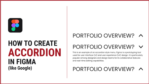
Learn the process of creating an interactive drop-down accordion-style menu, inspired by the sleek design of Google’s interface. Follow these step-by-step instructions to replicate this functionality seamlessly:
Create Your Figma Elements
Start by assembling the three essential elements: a line of text, a text character transformed into a functional arrow, and a text block.
Align and Frame
- Vertically align the text and arrow elements and add them to an Auto Layout.
- Give the resulting frame a distinct name, let’s call it “accordion.”
Set Element Properties
- Ensure that the elements within the “accordion” frame are set to zero.
- Choose the question, and switch the horizontal resizing from a fixed width to a fill container.
- This adjustment ensures responsiveness, enabling size modifications while preserving appropriate resizing proportions.
Auto Layout for Responsiveness
- Select both the “accordion” and the body text, placing them into another Auto Layout.
- Set the spacing between them to zero and change horizontal resizing from fixed width to fill container.
- Now, your frame is not only responsive but also adjusts in size appropriately.
Component Creation
- Select the “accordion” element and proceed to create a component with two variants: an open state and a closed state.
- In the closed state, hide unnecessary details by selecting the body text and using the hide icon.
- For the open state, rotate the arrow to -90°.
Transition Animation
- Navigate to the Prototype stage by clicking from Design to Prototype on the right side.
- Choose the closed state of the accordion and drag the connector to the open state.
- Opt for the smart animate option.
- Repeat this process for the open state, ensuring a seamless transition when the user interacts with the accordion.
Test Your Creation
- To test the component, generate a testing frame and place the component within it.
- Simulate an accordion section by creating three questions within the frame.
- Adjust the spacing between the questions and incorporate them into Auto Layout.
- Click the preview button to observe a preview of your interactive element in action.
There you have it! Follow these steps, and you’ll have a polished and functional accordion-style menu, similar to Google’s interface. Test it out, and hopefully, it works seamlessly for your design needs! If not, check out the video below. Subscribe to this channel and hit the notification bell for the next video, where we’ll delve into sharing files in Figma, featuring the ‘Interactive Accordion Exercise!’
