In today’s tutorial, let’s dive into the nuances of scroll behaviours in Figma, providing a quick and straightforward breakdown of each.
Exploring Scroll Behaviors
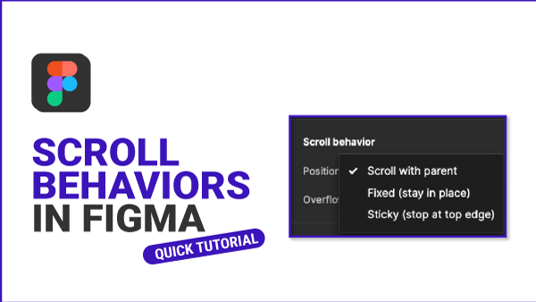
Let’s start by examining the scroll behaviours on the main header.” Clicking on the prototype stage reveals three key scroll behaviours: “Scroll with Parent,” “Fixed (Stay in Place),” and “Sticky (Stop at Top Edge).”
Scroll with Parent
When we choose “Scroll with Parent,” you’ll see that as we scroll, the header moves in tandem with the parent, gliding up and down the frame.
This behaviour is ideal for replicating the experience of navigating longer pages of content.
Fixed (Stay in Place)
Switching to a fixed position, you’ll notice that the primary header remains steadfast as we attempt to scroll.
This functionality proves invaluable for websites or applications, ensuring critical elements like headers or navigation bars remain visible and accessible as users peruse content.
Sticky (Stop at Top Edge)
Now, let’s set it to “Sticky,” causing the header to move upward upon scrolling and coming to a stop precisely at the top edge.
This feature is particularly advantageous in UI design, ensuring consistent access to specific elements, such as headers or navigation bars, as users interact with the content.
And there you have it! We’ve delved into the essential aspects of scroll behaviors in Figma, each serving a distinct purpose in elevating user interface design. Stay tuned for our upcoming tutorials, where we’ll explore some exciting scrollable ideas to enhance your designs.
