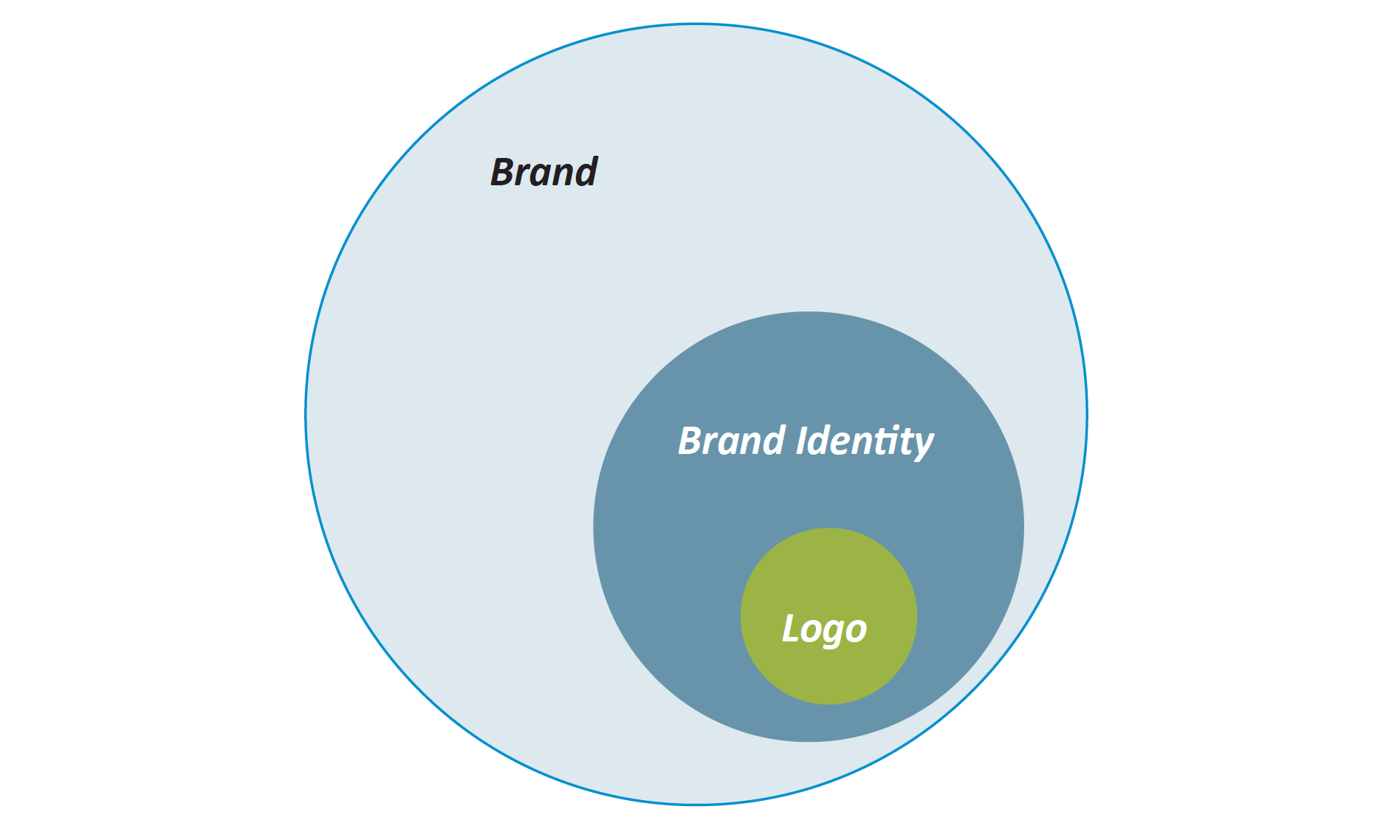
A logo is not a brand. It is either a graphic mark, symbol, icon or emblem mostly used by companies or persons to promote and identify the business and company’s personality. It’s the foundation of a brand marketing strategy and should be designed carefully.
A brand identity is the visual aspects that form part of the overall brand, such as:
- A Logo (symbol or icon of the entire identity & brand)
- Stationery (Company business card, letterhead, envelopes)
- Marketing and Communications Collateral (flyers, brochures, books, websites, etc.)
- Products (products sold and the packaging in which they come in)
- Clothing and Apparel Design
- Signage (Interior & exterior design)
- Messages & Actions (Conveyed via indirect or direct modes of communication)
- Other Communication (Audio, smell, touch, etc.)
- Anything visual that represents the business.
A brand is the perceived emotional corporate image as a whole. It includes the logo and the full visual position created by brand identity. But it also includes many other areas that may consist of your content messaging and storytelling. Customer service and the client experience are also a part of a brand too.
Types of Logos
Various type of logos is in use these days, and it has become the most critical part of a business and promoting industries. A good logo always should be able to get people’s attention from simplicity and memorability — the basic types of logos and what kind of businesses are using those specified types commonly.
Symbol or Icon
A popular type of logo uses to represent the company is a bold but straightforward manner. In most cases, the image is abstract and stylish to give proper meaning and recognition. Most companies that have this type of logos have direct and minimal primary logo such as Apple, Shell and Mercedes-Benz.


Wordmark
Some companies use stylize and unique text logos that spell out their company name. Sometimes they create custom fonts to use for their branding and marketing purpose such as Coca Cola, Disney and Instagram.

Lettermark
Companies such as Hewlett Packard, General Electric, Volkswagen are known for their lettermark logos. Letter marks are exclusively typographic. These type of logos use initials of the company name as a symbol to represent their identity.


Combination Mark
This type of logo is a combination of symbols and wordmarks. A well-designed combination logo looks just as good with the elements separated as it does together. Adobe, Adidas, and Target are prime examples of combination mark logos.
Emblem
This type of logos encases the company name within the design. Companies like Harley Davidson, Starbucks, and the NHL uses this type of logotypes.

Principles of Logo Design
An effective logo should be distinctive, appropriate, practical, simple and should be able to convey the intended message. There are a few principles you should follow when designing a logo to get a better result.
1. Simple
Complicated logos with too many elements can be distracting and confusing to your audience. You want to take all your design inspiration and reduce it down to the basics. An effective logo should only include features that are critical to your business.
Nike is an excellent example of how simplicity can get you further than you’d imagine. A simple stroke can portray a lot about their business and leave a strong impression.
Try to stay away from patterns, textures, shadows, gradients —they are hard to display in print or online. Logos that are coloured, black, or grey saved as an SVG (scalable vector graphic) will load faster.
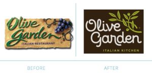
Olive Garden went from a 3D realistic logo to more of a flat design. The logo loads much faster on a mobile device but is clean and simple, making the design versatile in any form of media.
2. Memorable
It takes just a second or two to make a great first impression, but you need to make sure your logo makes a lasting impression as well. Sharp colours, attractive fonts, and unique shapes and graphics or a catchy tag line are just a few ways you can stand out in a crowd.
 Twitter is one of the best examples of excellent logo design. Once you see that small flying bluebird icon, you know it’s linked to an action – tweeting. The automatic correlation you make between the tweet of a bird (the logo) and the act of tweeting is exceptionally memorable.
3. Timeless
 A company can be in business for months, years, decades or even centuries; therefore, it needs a logo that will stand the test of time and not ‘age’ badly. Following trends, such as popular fonts and styles, will potentially become a burden when the trend fizzles out. You want your logo to be able to stand the test of time.
Coca-Cola’s logo, a classic & timeless logo created over a century ago, and the logo is still appealing and relevant today.
4. Versatile
One of the greatest gifts you can give your logo is the power of versatility. When you design a logo, you must be mindful of its final usage. You will be resizing this logo onto different surfaces and materials, such as letterheads, banners, websites, or business cards. Pick a logo that is effective at any size.
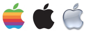
The same goes for colour. If you design a logo that is heavily reliant on colour, flip the logo into a black and white logo. Now, think about how the logo is effected by receiving a fax from a fax machine with this logo? Versatility will make your logo flexible enough to be used in any occasion such as Apple’s logo.
5. Appropriate
What is a brand without a story? You want to build a strong connection with your consumers by telling them your brand story, and that requires a deep understanding of your audience. After you have researched and analyzed your audience (or quite possibly, interviewed the client), you will have a better sense of which font, colour or graphics to use. Your logo must be tailored to your audience and appropriate for your business.
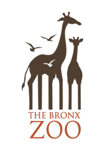
Negative space logos are great at telling a story, a design which uses the background of an image to create another image. This negative space designing is a unique and smart way to convey many thoughts and visions.
For example, New York is a big city with tall buildings. Giraffes are big, tall, exotic animals. The Bronx Zoo is in the heart of New York. Put it all together, and you have a fantastic logo that tells you everything you need to know. Can you see the city line in this logo?
