Welcome back to another Figma tutorial! Today, we’ll explore typography in Figma, delving beyond font selection into how to effectively convey messages through text design.
Typography involves more than choosing a font; it encompasses factors like readability, mood, and brand consistency. In Figma, you can experiment with font styles, weights, sizes, and more to achieve the perfect design combination. Let’s dive into some best practices.
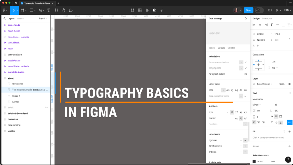
When working with text in Figma, you can adjust font properties such as typeface, weight, size, and line height (leading). Additionally, you can control letter spacing, text alignment, and text box container settings like width and height.
Figma offers a range of typographic customization options. For instance, you can change text decoration (underline, strike-through), text case (uppercase, lowercase, title case), and paragraph spacing for better organization and readability.
Moreover, Figma provides advanced features like text truncation, paragraph indentation, and stylistic variations such as ligatures, kerning pairs, and stylistic sets. These features allow for precise control over text appearance and functionality.
Variables in Figma’s typography settings enable dynamic adjustments to text properties like slant and weight, enhancing flexibility and design control.
Stay tuned for our next tutorial where we’ll explore advanced text styling in Figma. Don’t forget to subscribe for more design tips and tricks. Thanks for watching!