Ever typed a line of text in Adobe Illustrator, only to watch it sprint all the way off the side of your artboard?
Don’t worry—you didn’t break anything. You are just using the wrong text tool for the job.
Illustrator has three completely different ways to handle text. Picking the right one before you start typing will save you a massive amount of layout frustration. Here is how they work and when to use each one.
1. Point Type (The Single Click)
Best for: Headlines, short labels, or logos.
To use it, select the Type Tool (T), click exactly once on your artboard, and start typing.
As you add more words, the boundary line just keeps growing horizontally on a single line. It will never wrap to a new line on its own unless you hit Enter on your keyboard.
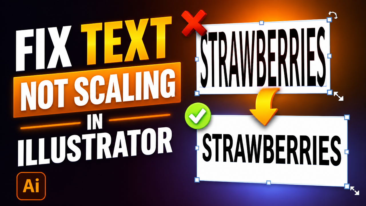
Crucial Warning: If you grab the corner handle of a Point Type box and drag it to try and make room for more text, you will distort and stretch your letters. Never resize a headline this way! If you want the font size bigger, use the Character panel or hold Shift while scaling.
2. Area Type (The Paragraph Box)
Best for: Body copy, multi-line paragraphs, or multi-column layouts.
To use it, select the Type Tool (T), but instead of clicking once, click and drag to draw a bounding box. When you paste or type your text inside this box, it automatically wraps at the edge of the rectangle.
The best part? If you resize this box by dragging the corners, your text safely reflows to fit the new shape without stretching a single letter.
Typing Inside Custom Shapes
Because Illustrator treats a standard text box exactly like a regular rectangle shape, you aren’t limited to squares.
Use the Ellipse or Polygon tool to draw any shape you want (like a circle).
Switch to the Area Type Tool (hidden inside the Type tool flyout menu).
Click directly on the outer path of your shape.
Illustrator will instantly turn that shape into a text container, wrapping your text beautifully to fit the custom edges.
3. Touch Type (Stylizing Single Letters)
Best for: Custom titles, poster designs, and logo tweaks.
In the old days, if you wanted to make a single letter in a word bigger or rotate it, you had to convert the text to outlines (Command/Control Shift O ). The major downside? Once you did that, you could no longer fix a typo or change the font.
The Touch Type Tool (Shift T) fixes this. With it, you can click on an individual letter inside a live word and scale, rotate, or move it up and down. The rest of the word shifts over to make room, and the text stays 100% editable. You can still double-click and change the spelling at any time.
This video was created to add more clarity from Adobe’s original tutorial: https://www.youtube.com/watch?v=fyphDxZQazc
The Quick Summary
Keep this simple rule of thumb in mind for your next design project:
Headlines, Titles & Labels: Click once (Point Type).
Paragraphs, Columns & Blocks: Drag a box (Area Type).
Custom Letter Layouts: Tweak individual characters (Touch Type).
Which of these tools do you find yourself using the most? Let me know in the comments section below!